2024 Student Project
Product Design, UX/UI Design, Illustration
Australia’s high rate of urbanisation means that most people experience a significant disconnect between their food production and consumption, alongside this Australians reportedly have a lacking understanding and appreciation of how their food is grown.
In an effort to resolve these issues, I was tasked to create a mobile app prototype for Sustainability Victoria. The app needed to adhere to Sustainability Victoria's existing branding and design language, solve the above discussed problems and leverage modern UX design principles and trends to suit a modern audience.
Client Research
Sustainability Victoria is a company which manages a number of sustainability focused programmes and campaigns, with the aim to create a sustainable future for residents of Victoria, Australia. They wish for all Victorians to live more sustainably, due to their deep understanding of the worlds limited resources and why they should be used with longevity in mind.
Defining User Group
Growing your own food is typically a hobby done by people in the mid 30s and above, and there’s already of apps aimed at these people, therefore I'm going to aim my app at younger adults aged 18–30, as there is currently a gap in the market for this age group, and also meets Sustainability Victoria’s brand values, with the idea of stopping the problem before it occurs, which in this case can be done by teaching young adults about sustainability through growing and cooking their own food as soon as they gain full independence.
User Research
To begin my user research I conducted a series of 5 interviews ranging in length from 5 to 10 minutes. This of course produced lots of data, in order to sort some of this I created an affinity map, creating 6 categories of information which not only simplified the user responses but also highlighted the most important areas of my topic.
User Research – Affinity Mapping
User Research – Affinity Mapping Results
In addition to my interviews I also conducted a survey of 10 questions which produced quantitive data from my 21 respondents. This again helped to narrow down the specific issues I should focus my app on in the larger context of growing and cooking your own food.
The outcome of this research was that I found young adults aged 18–30 would like to grow their own food, however most don't have the knowledge to do so, and are worried they would lose interest and forget the necessary tasks in taking care of their garden.
Ideation and Design Phase
Creating a wide range of sketches and planning of my application based of my findings through my research ensured I took a robust concept and plan into the digital development phase.
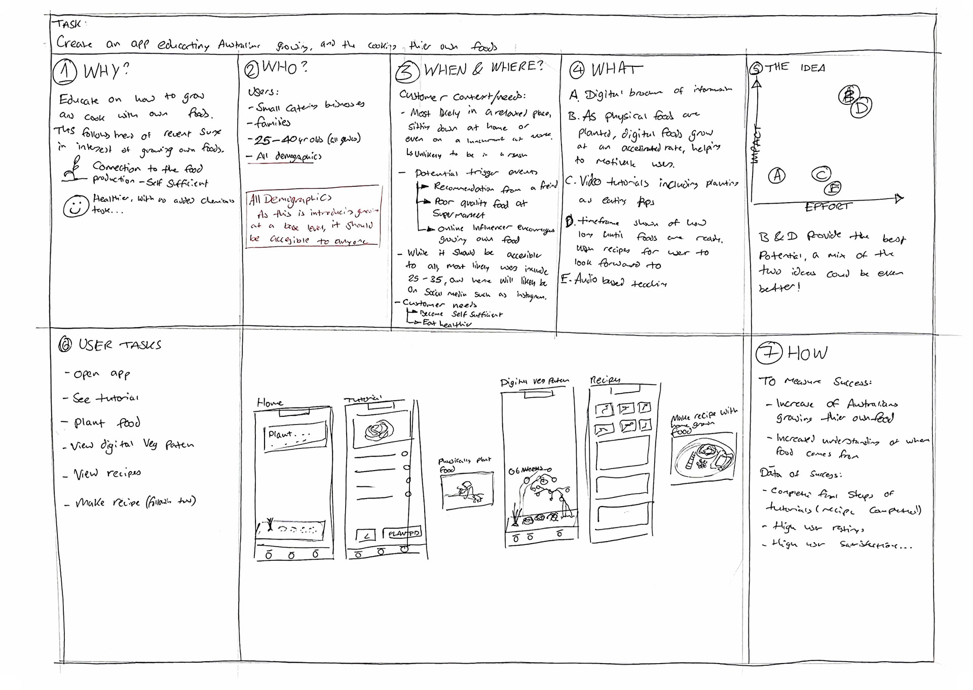
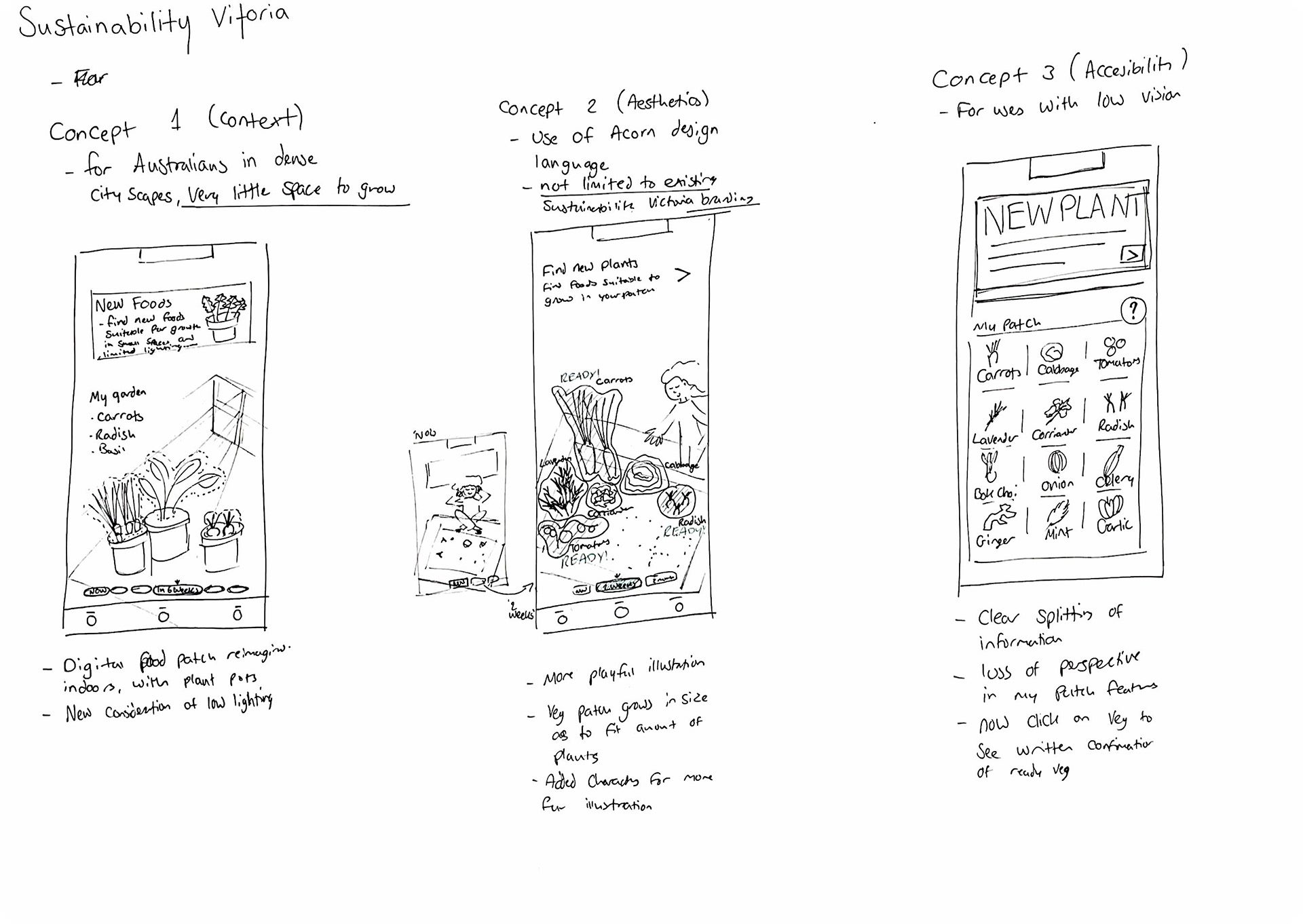
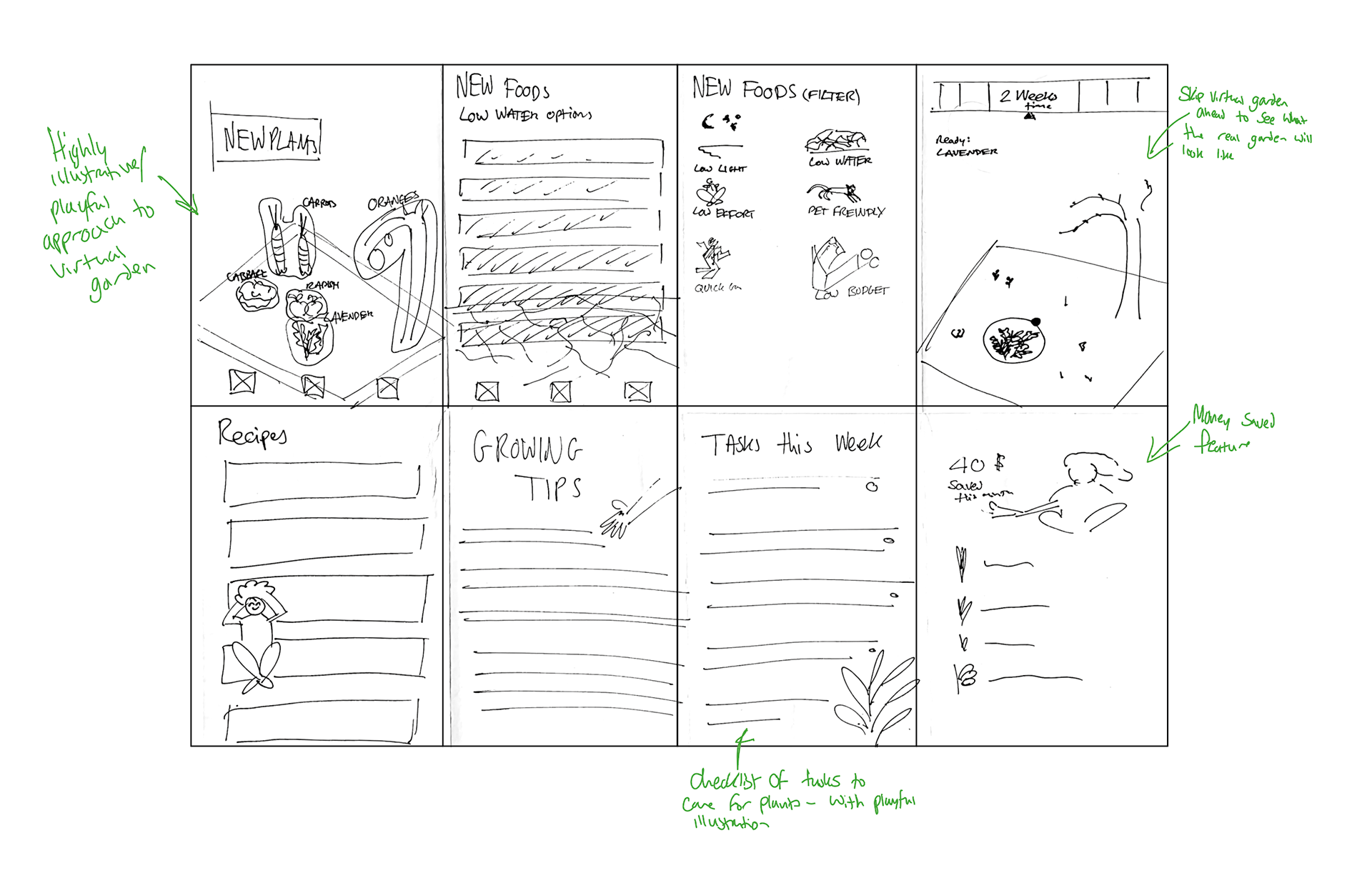
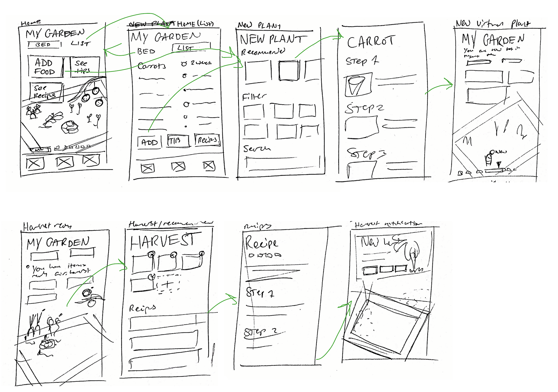
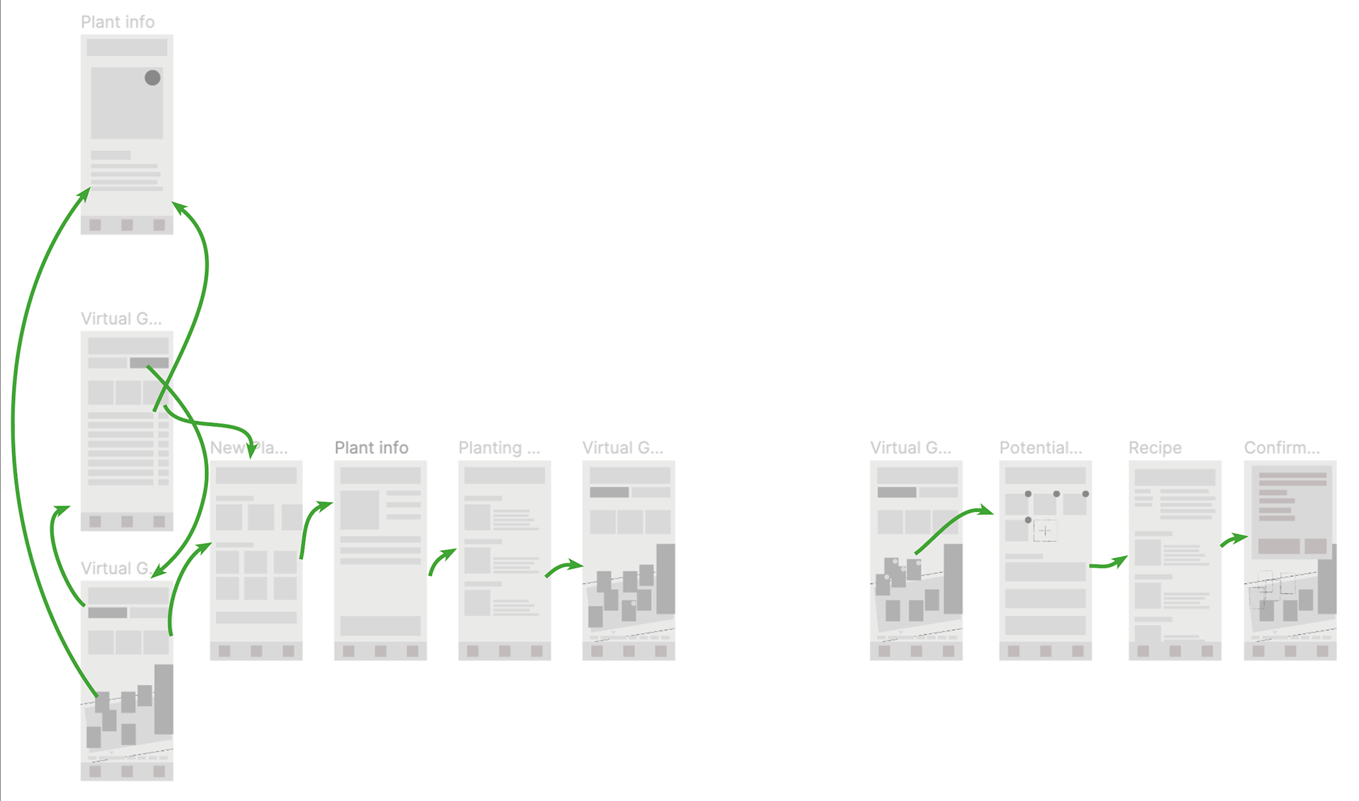
The solution I came to was as a user planted a food in real life, they would also plant the same food in a virtual garden on their phone. This virtual garden can then be skipped ahead weeks or even months down the line, allowing users to 'preview' their real life garden and stay engaged in growing their own food.
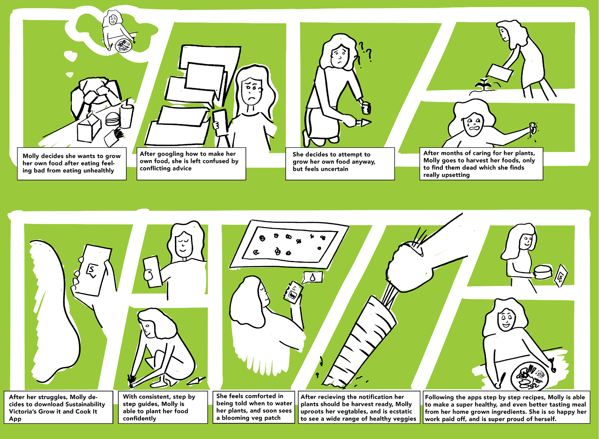
User Storyboarding
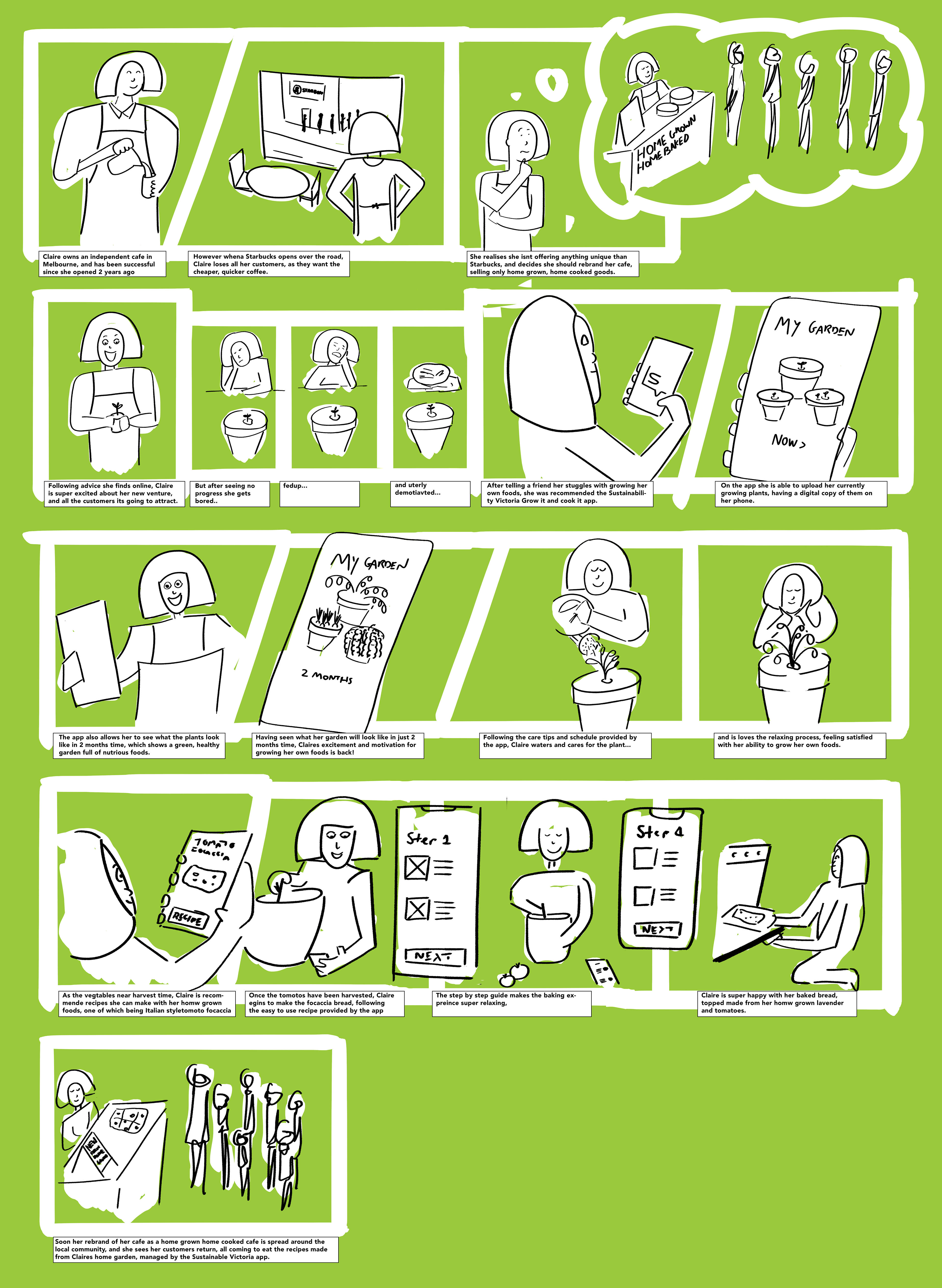
First Digital Prototype Iteration
My Garden Evolution Screens
Adding a Plant User Flow Screens
Finding a Recipe With Grown Items Flow Screens
User Testing
Conducting 5 user tests, I was able to find what was working in my prototype, as-well as what wasn't.
Findings from the user testing
Issues with navigation bar — the icon for My Garden is so much heavier than the other two, making it look like your always in the My Garden page.
The My Garden section on the home page is too busy, the timeframe and the foods growing all clashing a bit too much. It was suggested I could represent foods that are harvest ready graphically, perhaps with colour.
A/B Split Testing
A/B Split Testing — Test 1
3/5 Users preferred Screen B
Screen B has a more logical user flow with seeing the garden, then seeing the tasks, it feels less busy at the bottom. Horizontal and vertically aligned items is more visually interesting
A/B Split Testing — Test 2
3/5 Users preferred Screen B
Users found that Screen Better had a better reading flow, but thought that hero image from Screen A was better as it follows the rest of the app UI.
A/B Split Testing — Test 3
5/5 Users preferred Screen A
Screen A makes use of colour to guide the viewers attention, and show buttons interactivity, whereas Screen B fails to do this completely. Users also found Screen B jarring and overbearing, preferring the subtly of use of colour in Screen A.
Final Solution
